
24 August 2017
Great game design tips: the art of color
Color — or even a lack of color — impacts every game ever created. Color is one of the primary emotional cues a designer can use to set the mood of a game and thus the player. In fact, understanding how to use color properly could be the difference between a hit app or one that gets almost no downloads.
In this roundup, let’s look at several resources which discuss the topic of color in game design.
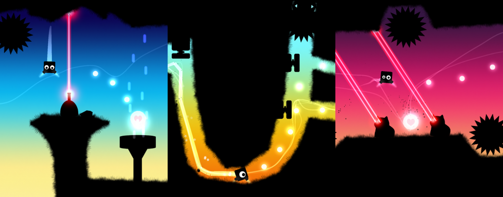
Screenshots from BotHeads.
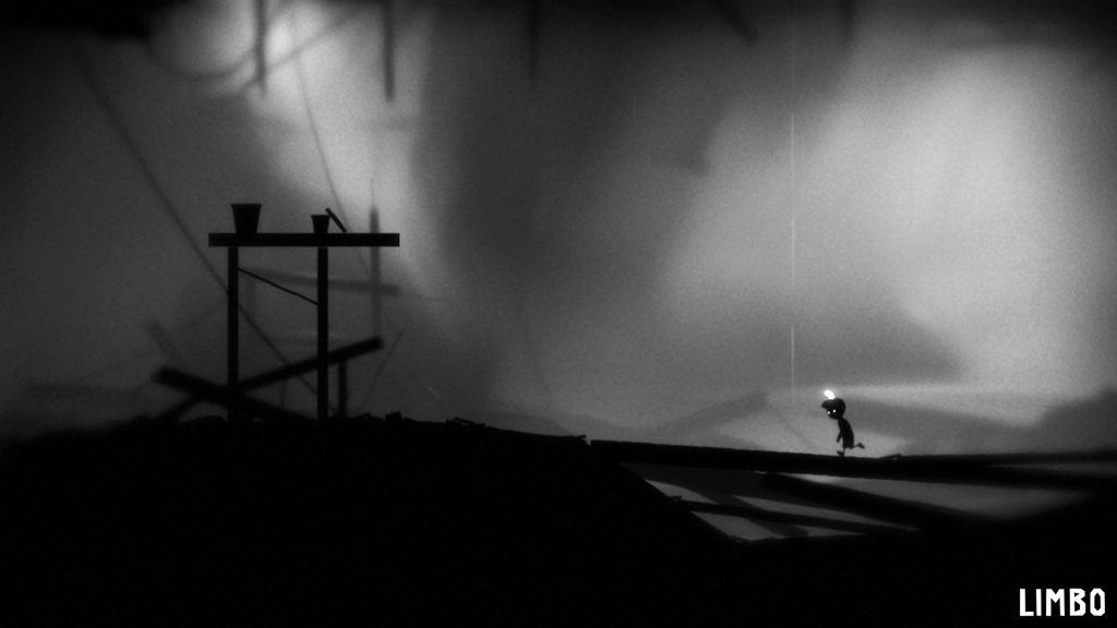
Screenshot from Limbo.
1. The Most Important Color In UI Design
In this post by Nick Babich, a software developer with a passion for UI/UX design, he discusses why the color blue is so popular in UI design and why it’s used in many mobile apps. From emotional reasons to technical reasons, he outlines several reasons why you should use blue.
2. Color in games: An in-depth look at one of game design’s most useful tools
In this article from Gamasutra, Herman Tulleken and Jonathan Bailey take a deep dive into the purpose color serves in games. Not only do they show how games use color to brand themselves, they get into discussions about the emotion of color and how it’s used as signifiers and identifiers. This article will certainly make you think about color and its impact!
3. Picking a Color Palette for Your Game’s Artwork
In this article, Tyler Seitz discusses color palettes and how to create them, along with some basic color theory that every game developer should understand.

Sorry, the comment form is closed at this time.